RentAzerbaijan is a web and mobile rental platform created for users who want to find short-term or long-term stays across Azerbaijan. The product includes property search, filters, listing details, booking flow, user trips, favorites, messaging, host dashboard, income tracking, and authentication screens.
The main goal was to create a clean and trustworthy experience where users can browse rental homes quickly, understand listing details clearly, and complete booking actions without confusion. The visual direction uses a light interface, soft turquoise accents, travel-inspired imagery, and simple card-based layouts to make the platform feel fresh, local, and easy to use.
The main challenge was designing a rental platform that works equally well for both guests and property owners. Guests need a simple way to search, filter, compare, save, and book listings, while hosts need tools to manage apartments, messages, reservations, and income.
Another challenge was keeping the interface visually rich without making it feel crowded. Rental platforms usually contain many details: images, prices, locations, amenities, dates, ratings, reviews, policies, and booking information. The design needed to organize all of this into a clear structure, especially on mobile screens where space is limited.
Struggle to compare
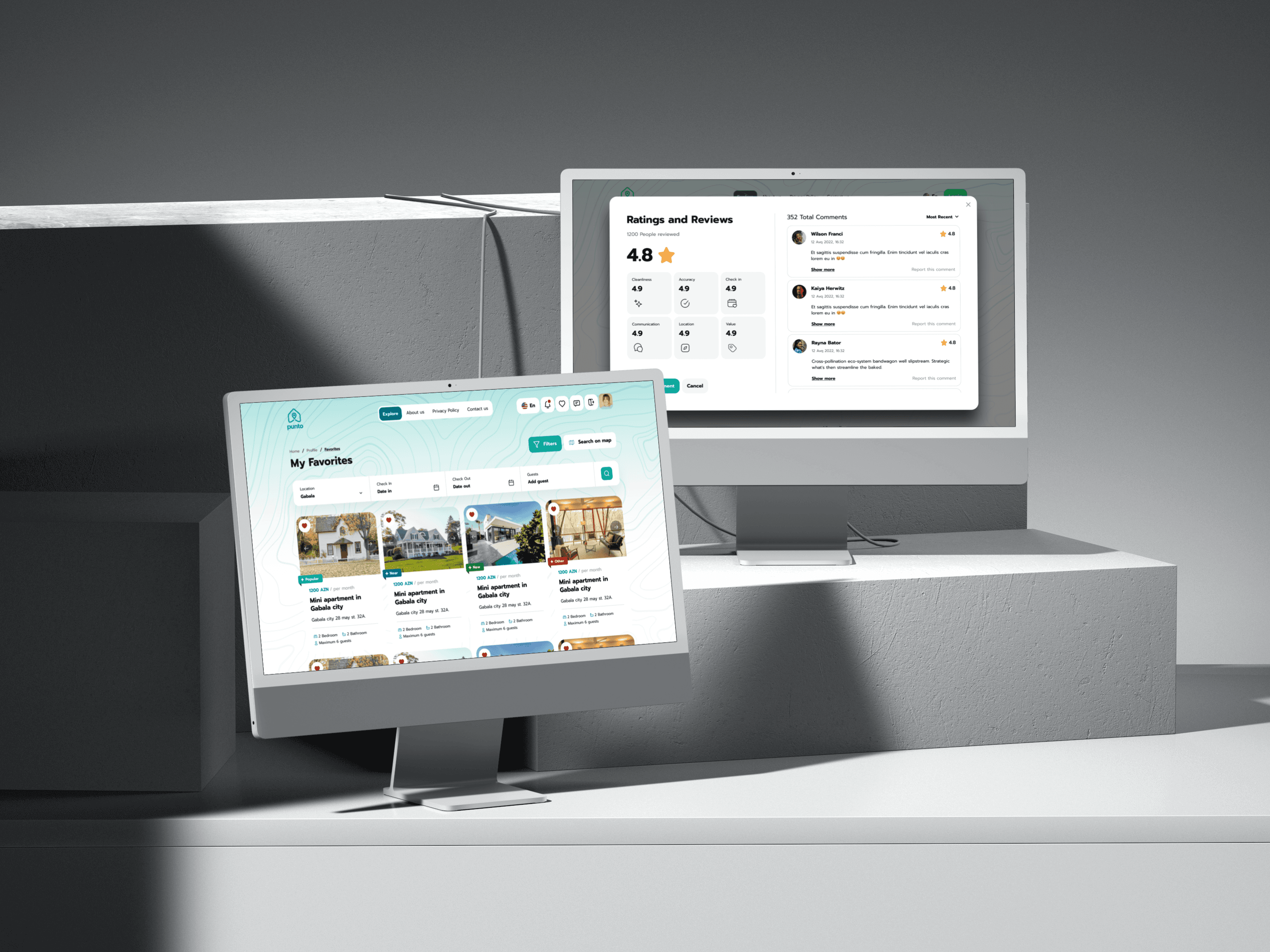
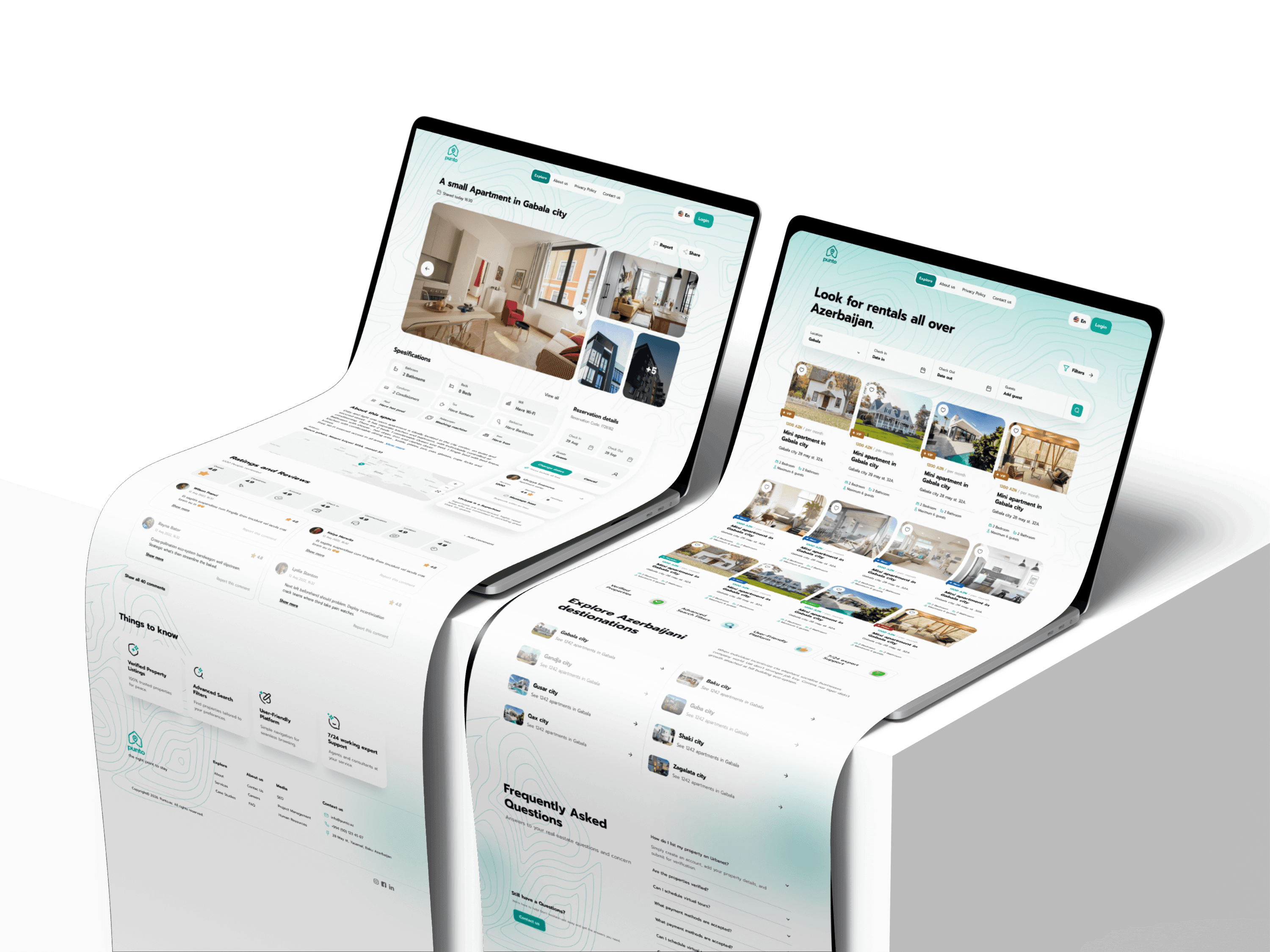
When users search for a place to stay, they need to scan many listings at once. If the cards are overloaded or the filters are unclear, they lose time and confidence. The design solves this with structured listing cards, visible pricing, location details, image previews, favorite actions, and filter options.
Booking and communication
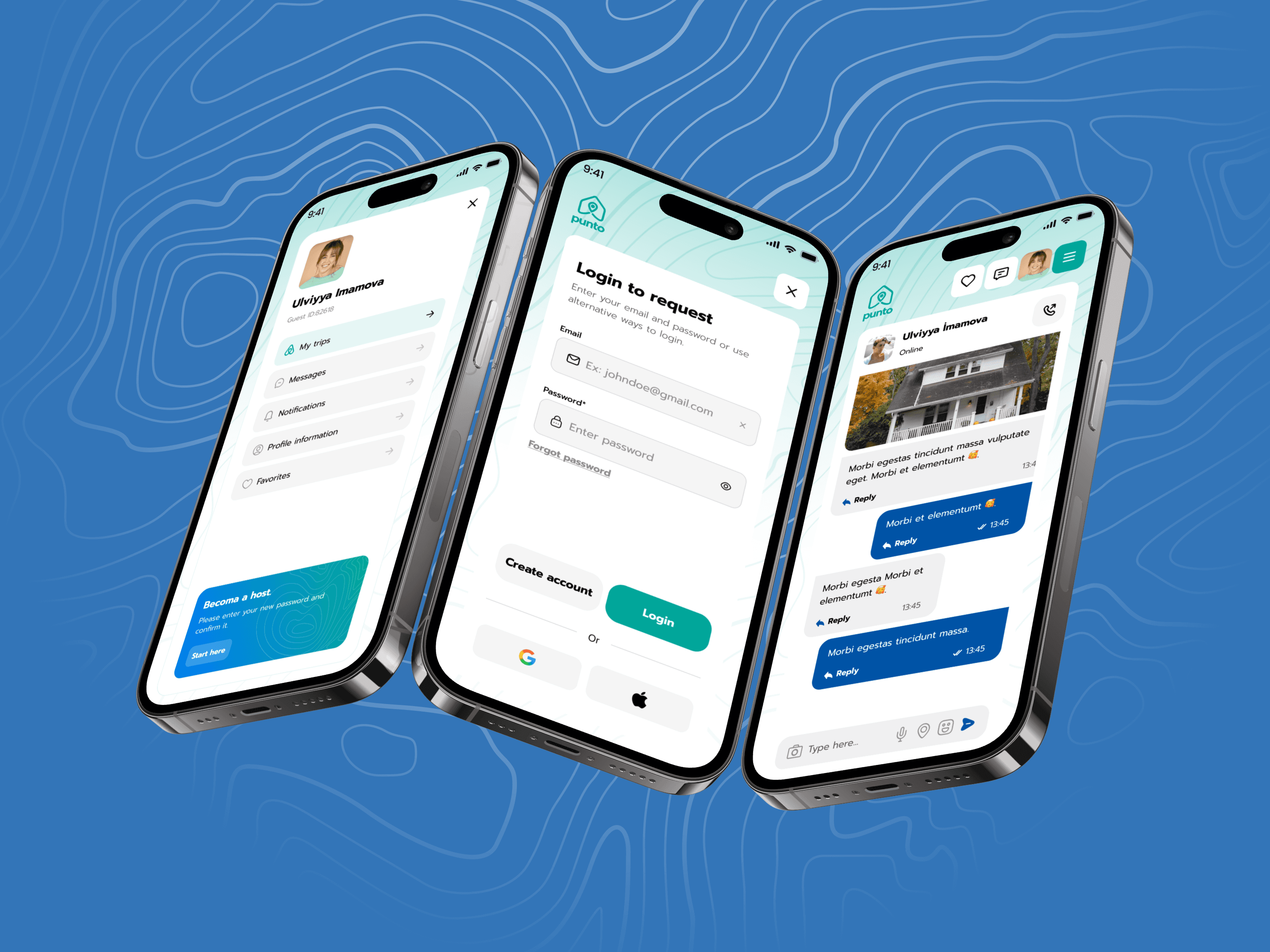
Users often need to contact hosts, check trip details, manage saved apartments, and review booking information in different places. This project connects the experience through dedicated pages for Messages, My Trips, My Favorites, and detailed listing pages, making the journey feel more complete and less fragmented.
Create a clear rental discovery experience
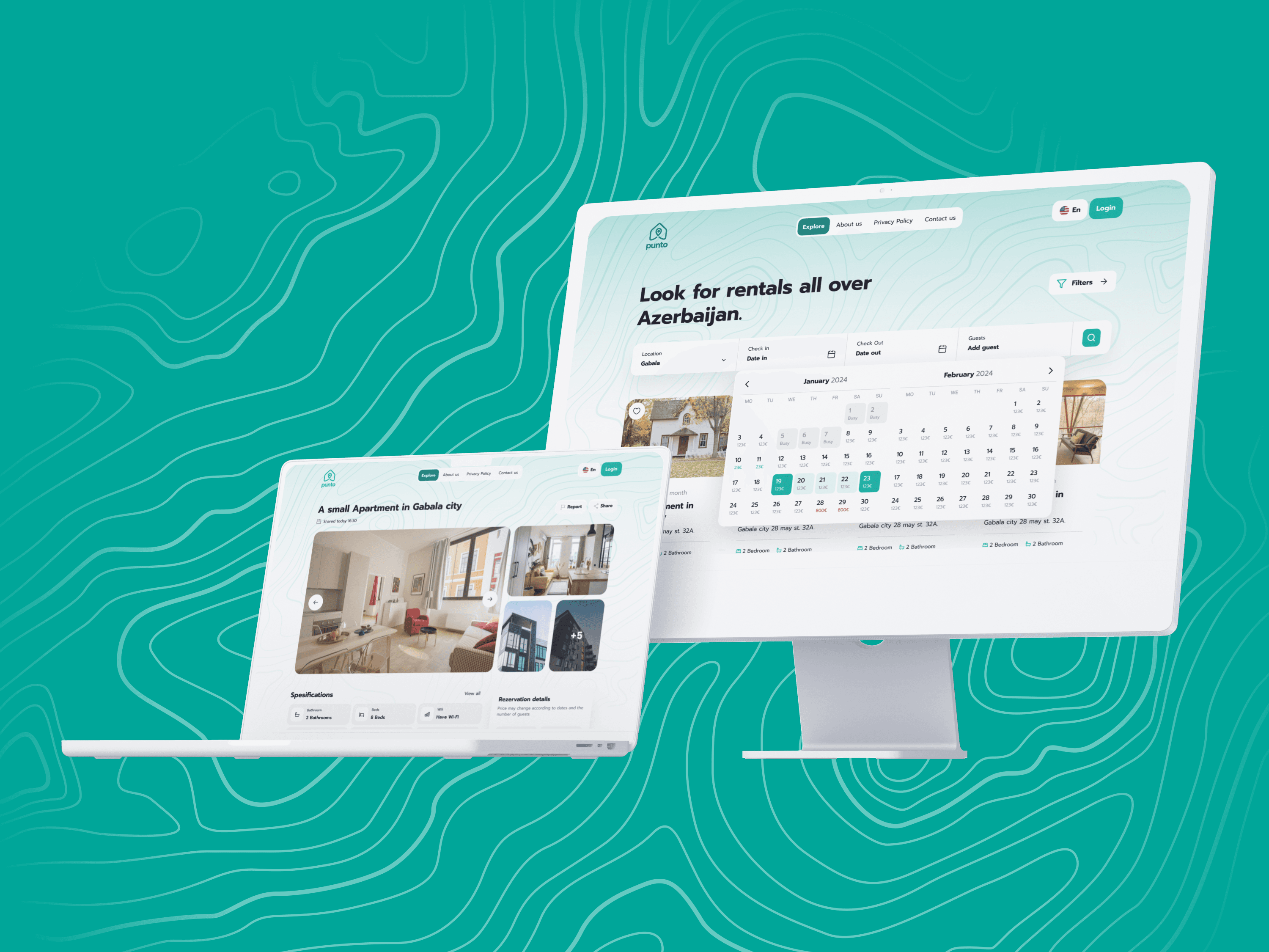
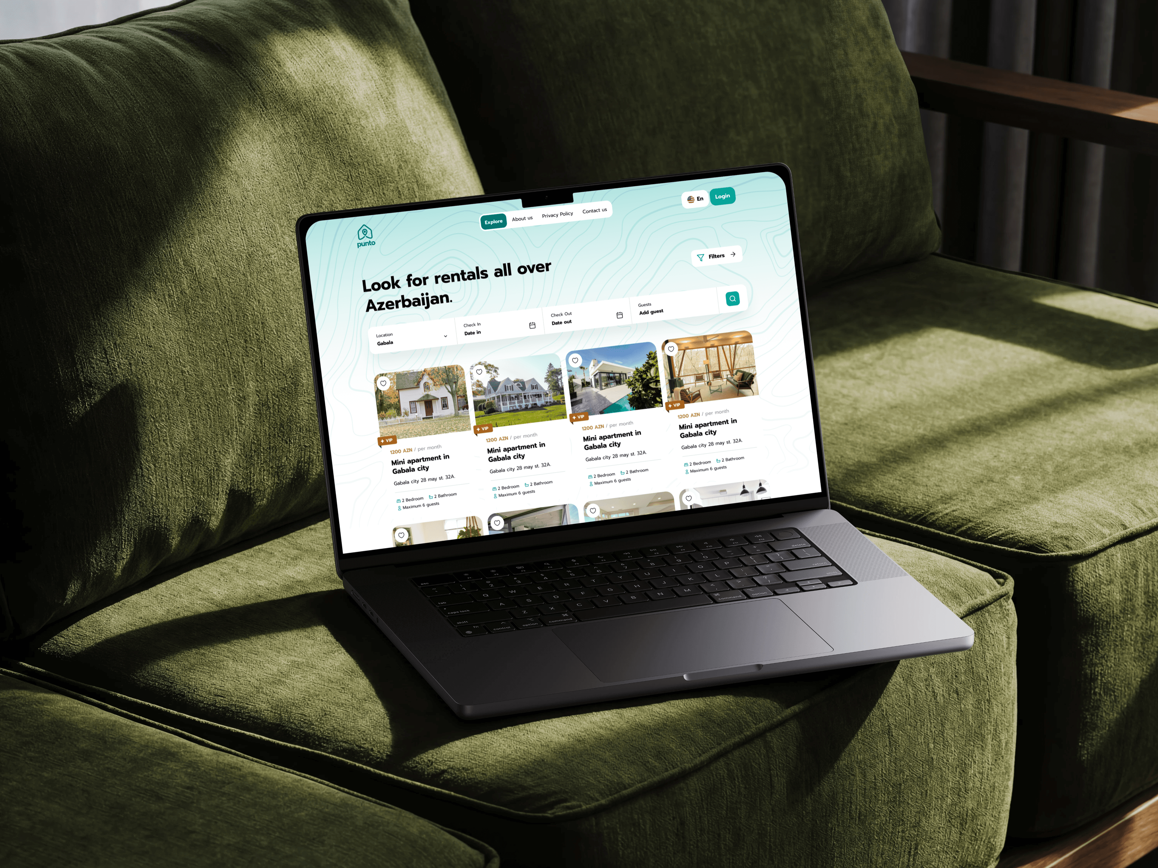
The homepage and listing pages were designed to help users start searching immediately. Search fields, category chips, listing cards, and destination sections make browsing feel natural.
Make filtering simple and useful
The filter screens allow users to narrow results by location, price, date, room type, property type, and other rental details without feeling buried inside complex forms.
Build trust through listing details
The listing detail page includes images, property information, amenities, booking widget, reviews, host information, location map, and house rules. This helps users make decisions with more confidence.
Support both guest and host flows
Besides the guest experience, the platform includes host-side screens such as My Apartments, Income, Messages, and listing management. This makes the product feel like a complete marketplace rather than only a search website.
Keep mobile and desktop consistent
The same design language was adapted across responsive desktop and mobile screens. Cards, buttons, navigation, and forms stay familiar across devices, so users do not feel like they are entering a different product when switching screens.


The final design delivers a complete responsive rental platform with core user flows for browsing, filtering, booking, messaging, saving favorites, managing trips, and handling host-side apartment activity.
The desktop version gives users a spacious browsing experience with large property cards, search tools, destination sections, FAQ, and footer navigation. The mobile version focuses on vertical scanning, compact filters, easy booking access, and simplified navigation.
Key screens include:
Guest side:
Home page, listing page, filters, listing detail, booking flow, favorites, my trips, messages, call screens, login, register, forgot password, and success states.
Host side:
My apartments, apartment management, messages, income dashboard, and listing overview.
The result is a clean, practical, and scalable rental product that feels suitable for both everyday users and property owners.
This project helped me focus on designing a product with two different user perspectives: the person looking for a place and the person offering one. The biggest learning point was balancing visual clarity with information density.
Rental platforms need a lot of details, but users should never feel trapped in a maze of cards and tiny text. By using clear sections, consistent cards, soft color accents, and responsive layouts, the final design became easier to scan and more comfortable to use.
If I continue improving this project, I would add more advanced features such as map-based search, verified host badges, real-time availability, price comparison, and a smoother checkout experience.