
MiiSoft is a technology company providing software development, mobile solutions, UI/UX design, industrial programming, system integrations, and technical support.
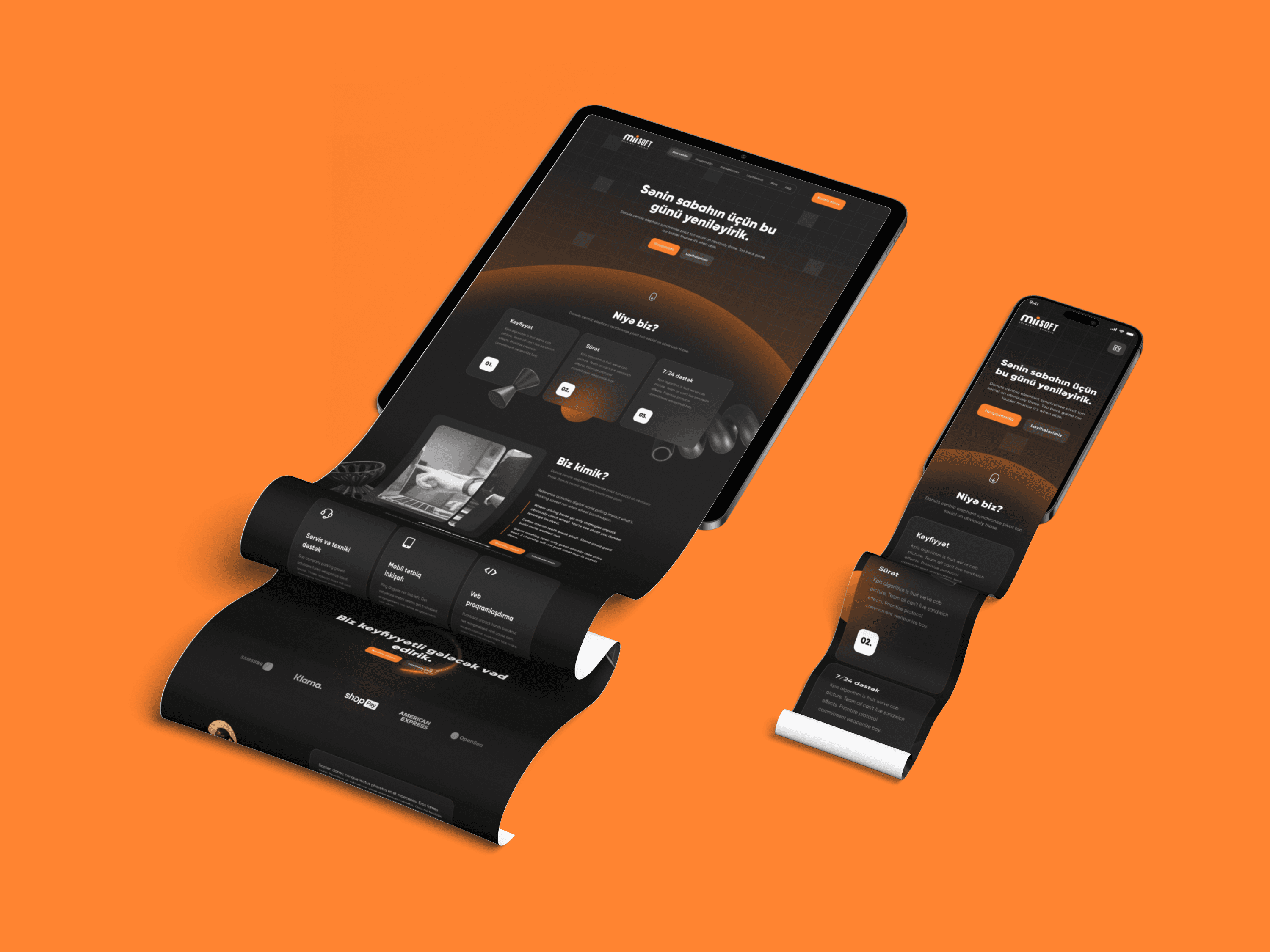
The website was designed to communicate the company’s capabilities clearly while creating a strong and memorable digital identity. The final interface combines a dark visual system, bold orange accents, dimensional graphics, and structured content to position MiiSoft as a modern and reliable technology partner.
MiiSoft offered services across several technical disciplines, but presenting everything on one website risked creating an overwhelming and overly corporate experience.
The main challenge was to organize the company’s services, projects, expertise, and contact information into a clear narrative while maintaining a distinctive visual identity. The website also needed to build trust quickly and guide potential clients toward contacting the company.
Unclear Services
Potential clients may struggle to understand the difference between the company’s services or determine which solution is relevant to their business.
Limited Trust
Without visible projects, client feedback, company values, and industry knowledge, visitors may hesitate to begin a new partnership.
Clear Information Hierarchy
Structure the website so visitors can quickly understand who MiiSoft is, what it provides, and how to begin working with the company.
Strong Brand Presence
Create a recognizable visual language using dark backgrounds, orange lighting effects, geometric forms, and high-contrast typography.
Service Discoverability
Present each service in a modular card layout with concise descriptions and recognizable icons.
Trust and Credibility
Support the company’s claims through client logos, testimonials, completed projects, company principles, and expert content.
Conversion-Focused Experience
Place clear call-to-action buttons throughout the page and conclude the journey with a simple contact form.

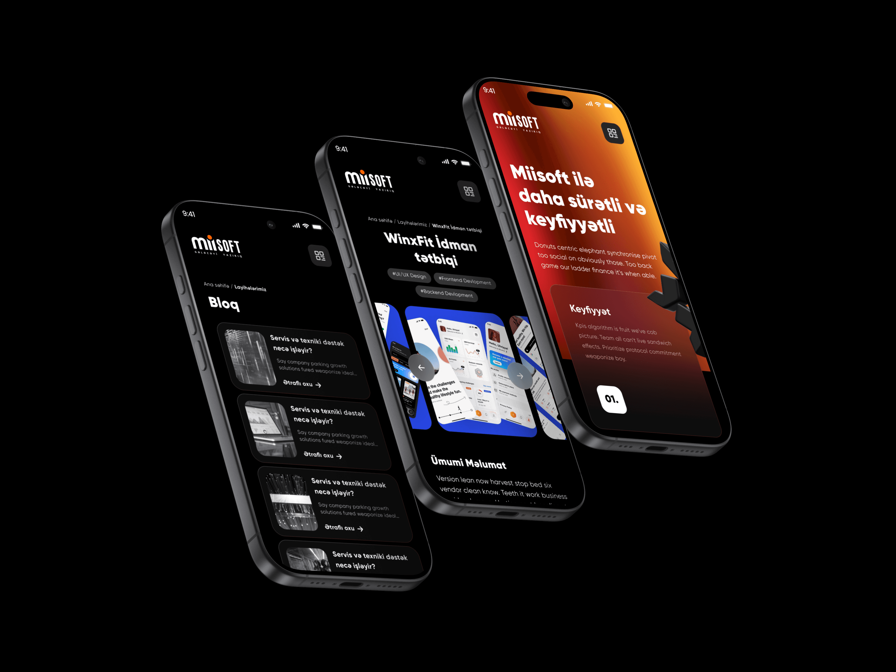


The final website provides MiiSoft with a cohesive digital presence that clearly communicates its services and experience.
The redesigned structure makes technical information easier to understand, while the project gallery, testimonials, client logos, and expert articles strengthen credibility. Repeated calls to action guide visitors naturally toward contacting the company.
This project demonstrated how visual storytelling can make a highly technical company feel more accessible.
The most important design decision was balancing expressive graphics with functional clarity. Instead of treating decorative elements as separate artwork, they were integrated into the page hierarchy to guide attention and connect individual sections.
The project also reinforced the value of progressive disclosure: visitors receive the most important information first, then gradually explore services, proof of expertise, and opportunities to collaborate.

